I have been meaning to share this for a while now.
I have been inspired by, learned from and generally challenged to think more and better by some of the folks that I consider to be thought leaders in testing, namely; James Bach, Michael Bolton and Jonathan Kohl. These are amongst the best thinkers in the testing profession. They are also some of the best at sharing their knowledge, for which I am eternally grateful. I am in some small part trying to mimic them by sharing some of my thoughts and experiences here.
So this is a little overdue homage to these giants upon whose shoulders I am standing.
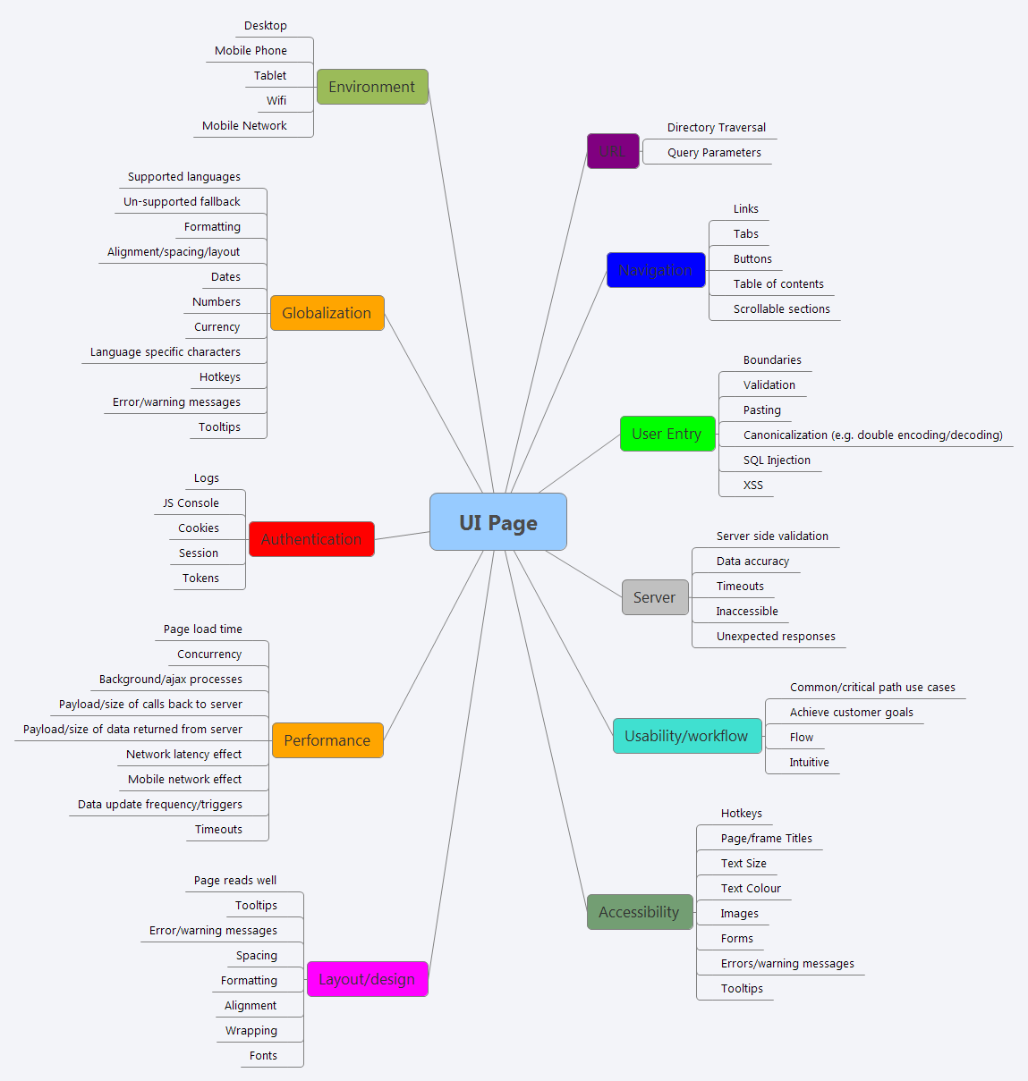
When trying to come up with ways to help my QA team think more broadly, differently and holistically about risks and tests for Web UI pages I realised that the mind map that I had developed over time for this purpose was not very easy to remember.
This was fine if you used my coverage outline template, (now updated to UNUSUAL PAGE), because that includes both the mindmap and the spreadsheet sections from the mindmap, thus no memory required.
But if you were in a meeting room discussing the user workflow or code design of the latest UI change, or at the desk of the User Experience designer looking over some wire frames in preparation for a 3 amigo style BDD discussion, (designed to ensure we all had a common, shared understanding of the requirements), or a story kickoff where we wanted to think about design and code risks and tests to mitigate those. But you didn’t have a laptop in front of you with the template to hand, how would you mentally run through the different aspects to consider in the context of the work in front of you?
Thinking about how I normally expanded my thoughts around where things could/would go wrong and what sorts of things I should consider testing I realised I often used heuristics I learned from the folks mentioned above. These heuristics were normally memorized in the form of simple mnemonics. Looking again at my mindmap I realised I was not that far from a fairly easy to remember mnemonic, so with a little tweaking I came up with UNUSUAL PAGE (start with URL and go clockwise);

Obviously not all of these branches or leaves will be applicable to your page and your context, and indeed the words I use here may mean different things to each of you, but that is sort of the point with a heuristic, it is a guide not a formula, optional not rigid.
Hopefully this will help and possibly inspire some of you to expand your thinking when you need to test a UI page or clarify the requirements around Web UI design etc
Feel free to share back your own variations on this heuristic or even your own heuristics.
I will share some more that I have been practicing with my team.
One thought on “UNUSUAL PAGE – a Web UI test heuristic”
Comments are closed.