QA: Does the error text and the text on the page need to be localised?
PM: Yes, we need to support the existing 14 languages for the Admin users
Dev: So, we should use the browser context to set the locale and display localised text if we support that locale and a fallback if we don’t?
PM: Yep, we might have a different setting later if we allow users to select a preferred locale that we store as part of their profile, but at login time we don’t know who they are so we should just use the browser locale.
QA: Cool, so the localised text will be supplied as part of the page render based on the initial request to the login page URL, including any text for error messages?
Dev: Yeah that’s the way we usually do it, so we can just send error codes back and the client side code can then render the appropriate message. Of course, the email address validation will be checked at both client and server so we can provide quick feedback to the user if they don’t provide a valid email address format in that field, but also guard against someone hitting the server directly with an invalid formatted email address.
QA: Nice, we should make sure we have unit tests covering the validation on both client and server then, I can add a single invalid test for each to show the error message (UI) and return code (server)
Dev: Should we have a ‘forgot password’ link and functionality?
PM: Yes, but I don’t think we have email functionality built yet, so we will defer that to a future story
QA: Should we have a timeout for responses from the server? i.e. how should we deal with the server being busy or unresponsive?
Dev: Yes, we should have a timeout value in the client code that will display a message to try again later, do we have a mockup for that?
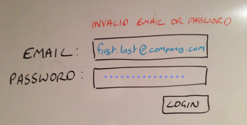
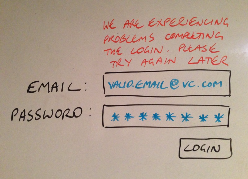
IxD: Agreed, let’s allow 10 seconds for the timeout and I think we should show a message to try again later if we timeout or if we get a 50X back from the server. Here is a mockup for how that text should be displayed;

QA: Do we need to support logging in on mobile devices? i.e. should this page follow a responsive design pattern?
PM: Yes, we need to support tablets right now and may need to support phone devices in the future, if we go responsive now then both should work.
QA: But we will only need to test on tablets for now, right?
PM: Yep, we will add testing stories for phone device testing later if we need them.
IxD: Responsive should be easy enough, but I may need to think about the length of the fields and the text we will need to display, particularly in different languages.
QA: What about accessibility? Do we need to support a WCAG level for this?
PM: Hmm, well we should but I think we will defer that to a future story. Let’s try to keep it in mind so that we don’t have to re-design later
Dev: What about functionality to enable maintenance notifications? i.e. the ability to add text to inform admins of upcoming maintenance or outages?
PM: Again, I want to defer that to a future story, I will sync up with Production IT to understand the requirements for that
QA: Do we need to limit the number of attempts to login so we can avoid brute force security attacks?
PM: Hmm, yes I think we should allow 3 attempts and then lock the account for maybe 5 minutes?
IxD: Actually I think 5 attempts would be better
PM: OK let’s go with 5 attempts and 5 minutes wait time
Dev: Do we want to log each and every login attempt (both successful and unsuccessful) or just the ones that result in a lock on the account?
PM: Hmm, I think we may need to log all attempts along with success, failure or lock so that we can provide an audit log if the customer needs it or if we need to show anything for a security audit.
QA: How do we want to show the lock message when 5 unsuccessful attempts have been made?
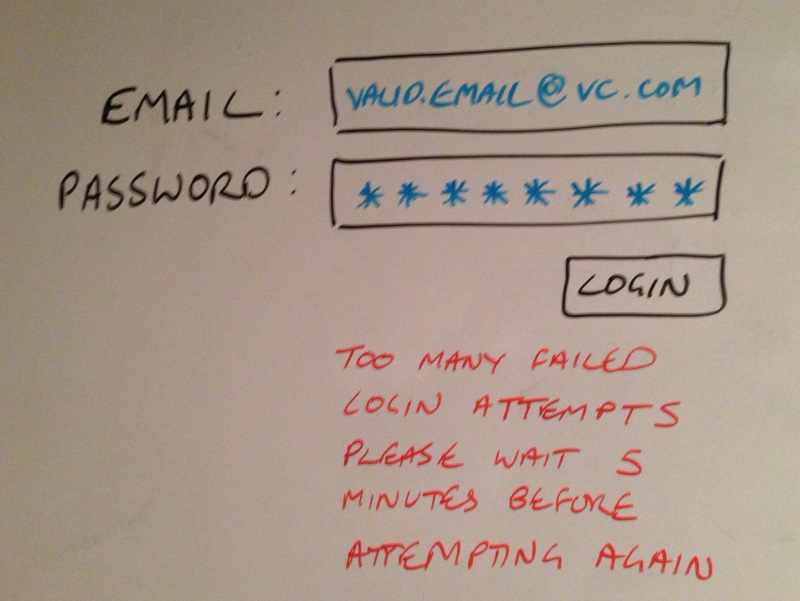
IxD: I am thinking red text again, but below the 2 boxes and to the left of the button this time, here is an updated mockup;

QA: How are we determining 5 attempts to login? Attempts using the same email address? Coming from the same IP? Some form of session identifier e.g. cookie?
Dev: Well the simplest is to set a session id in a cookie when an attempt is made on the server side and then to count how many attempts are made with this session id
QA: I presume that means someone malicious could simply brute force by creating ‘cookie-less’ requests?
Dev: Yeah, maybe we need to think about that one some more or talk to the security team.
QA: What should happen if the user attempts another login when we have locked them out?
.
.
.
QA: So based on all of that, what do we need as examples to accept this story with? I am thinking something like this;
Given a valid email address and password when I select login then I should be authenticated and taken to the dashboard page
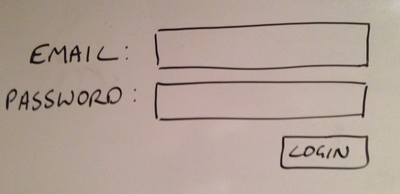
Given an invalid email address or password when I select login then should see a message indicating that my login attempt was unsuccessful
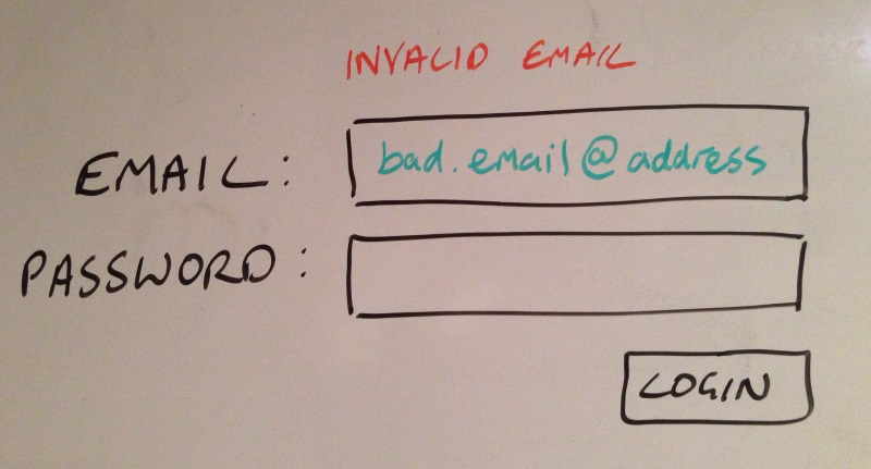
Given a badly formatted email address when I focus outside of the email address text field then I should see a message indicating that I have entered an incorrectly formatted email address
Given I am entering an invalid email address or password for the 5th time, when I select login then I should see a message indicating that I must wait 5 minutes before trying to login again
Dev: Should we include an AT for the server busy/down error message too?
QA: Is that required for acceptance? It is not something the user is in control of or can directly impact (without removing their network connection)
PM: I agree, we should test for it but I don’t think we need to include that in the Acceptance Tests
PM: I want to be sure this will look and work well on a tablet, so can we make sure we test that?
QA: Sure, we can do desk checks on an iPad if you like? But we will automate the ATs using Selenium and test with our most popular customer browsers for the admin interface
PM: Great
IxD: I am a bit concerned with how the localised text will look, can we make sure we test that too?
QA: Sure, we will test that the locale gets set and fallback as expected and we will do some basic checks with pseudo loc to make sure we don’t have overlap, truncation etc, but how about we include some different languages in the desk checks and with iPad to make sure you are ok with the the look and feel?
IxD: Sounds good
Dev: What about an AT for the audit logging?
PM: This is not a formal requirement from our customers or security team yet, so I want it tested but it does not need to be an AT as it is not a must-have part of the specification.
QA: No need for any regression tests here as this is all new code and not dependent on anything else.
PM: Do you need a new environment to test with?
QA: We already have the pipeline setup so we can just deploy to that from the CI system and test there, so no, we should be ok.
PM: What do we think are the biggest risks?
QA: Well I think security is the biggest as this is a login page, but we will mitigate that with validation in the client and server side plus testing focused on circumventing security, including the lockout to prevent brute forcing. The next biggest is email validation, this is notoriously problematic as most email clients do not conform to the RFCs. We will mitigate this by using our standard email validation to be consistent and to have one place to change if customers complain. We can also monitor the audit logs to see if people regularly use different methods of commenting or ‘tagging’ their emails that we should allow for. I am not really concerned about performance (very little traffic between server and client) and we will do regular desk checks for usability and style including the error messages, localised text, and responsive design.
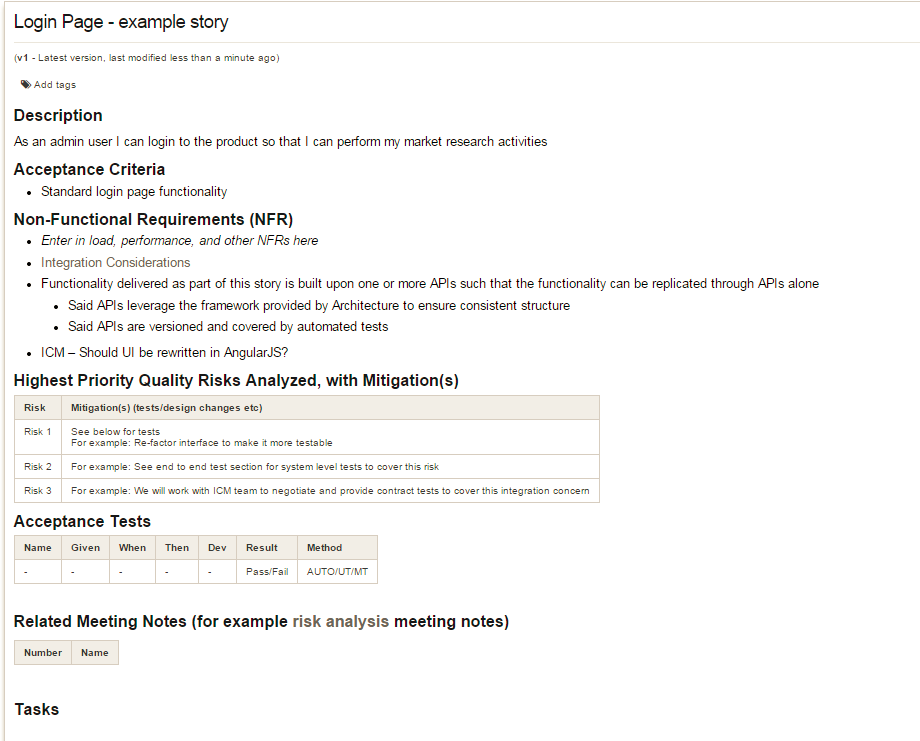
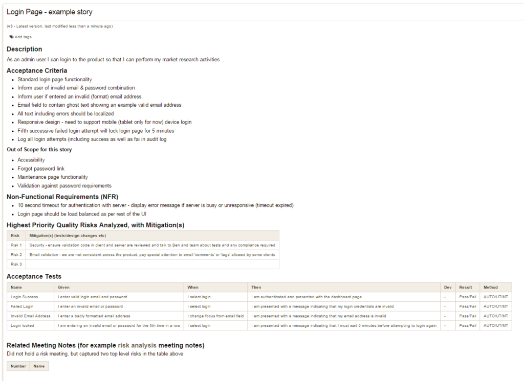
What does the story card look like now?
QA: We need to get more specific with our examples, we have captured the top level ideas and behaviours but we really want to provide examples (or specification by example) so that it is 100% clear how this will behave and so we know how we will demonstrate this to you for acceptance, so how about;
When I login
Then I should be presented with the dashboard page
When I login
Then I am presented with an error message in red text saying “Invalid email or password”
Given I have entered valid.email@notopleveldomain as the email address
When I change focus from the email field
Then I am presented with an error message in red text saying “invalid email address”
Given I am entering invalid credentials for the 5th time in a row
When I login
Then I am presented with an error message in red text saying “Too many failed login attempts, please wait 5 minutes before trying to login again”
PM: OK, we know the scope now and we have Acceptance Tests defined, so what do we think is the size of this story is?
At this point, we have clarified and agreed on the scope, and have a common understanding of what ‘done’ looks like in the form of some high-level acceptance tests. It is reasonable to guesstimate the size of the story at this point. But note we are much more likely to be able to guess more accurately once we have talked through the design in a bit more detail – the how we will solve this need in code discussion.
